LLT Transportation
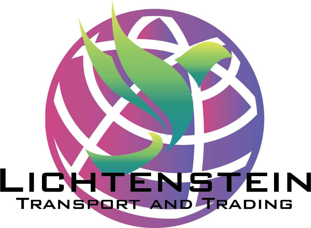
LLT Transportation approached me for a complete brand identity, one that reflected both the reliability of a transport and trading company and the fun, modern personality behind their business. This project included everything from initial logo creation to a full, professionally prepared branding toolkit.
For their visual identity, we leaned into a clean, structured aesthetic. To give the brand a strong, boxy, industrial feel, the primary heading font chosen was BankGothic, supported by Bahnschrift as an alternative option. For all paragraphs and long-form text, I introduced Bespoke, creating a balanced and readable contrast across all brand materials.
Instead of traditional solid colours, LLT Transportation embraced gradients to bring a fresh and dynamic look to their brand, showcasing their more playful side. Their palette includes two main gradient families: pink-to-purple and green-to-yellow, allowing them flexibility while still staying visually consistent.
The full branding guide I supplied provided detailed instructions on when and how to use each font, colour, and logo variation. This ensured brand consistency across all digital and print media, even as the company grows.
Deliverables included:
- Three complete logo variations
- Business card designs
- Professional letterheads
- Digital email signatures – three personalized versions for current staff, plus a fully editable template for future employees
LLT Transportation’s new identity now gives them a bold, modern, cohesive brand presence, one that feels just as dynamic as the work they do.

