Corals Surf Shack
Coral’s Surf Shack wasn’t a real client, but it played a big role in my journey. This brand became my personal practice project while I was learning web design, and later, when I moved into graphic design, I expanded it into a full branding system.
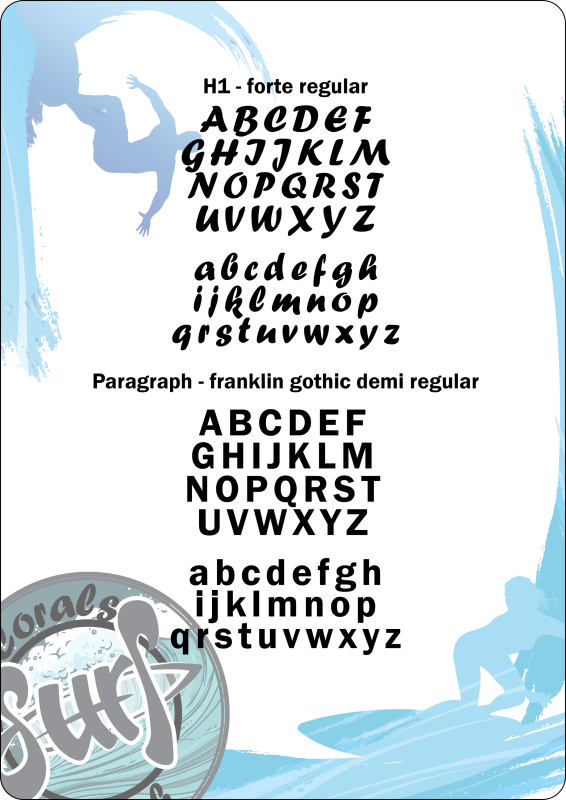
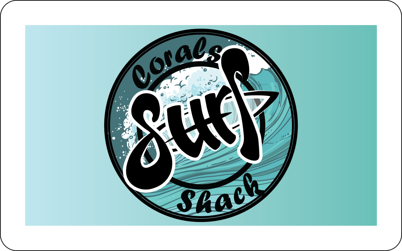
I developed a complete brand identity for Coral’s starting with a logo designed in three variations, along with a custom typography selection, and a clean, cohesive branding toolkit. To keep the identity fresh and ocean-inspired, I chose a soft light teal as the primary colour and built the palette using subtle shades of that same hue rather than an assortment of different colours. This created a calm, beachy, unified feel throughout the brand.
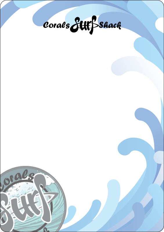
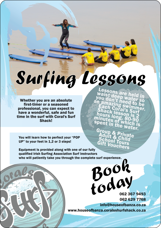
To finish the set, I designed a business card, a flyer, and a letterhead, all following the same streamlined aesthetic. Even though Coral’s Surf Shack wasn’t a real client, the project remains a favourite, showcasing my early design growth and my ability to create a full identity system from scratch.
