Rogers International LLC
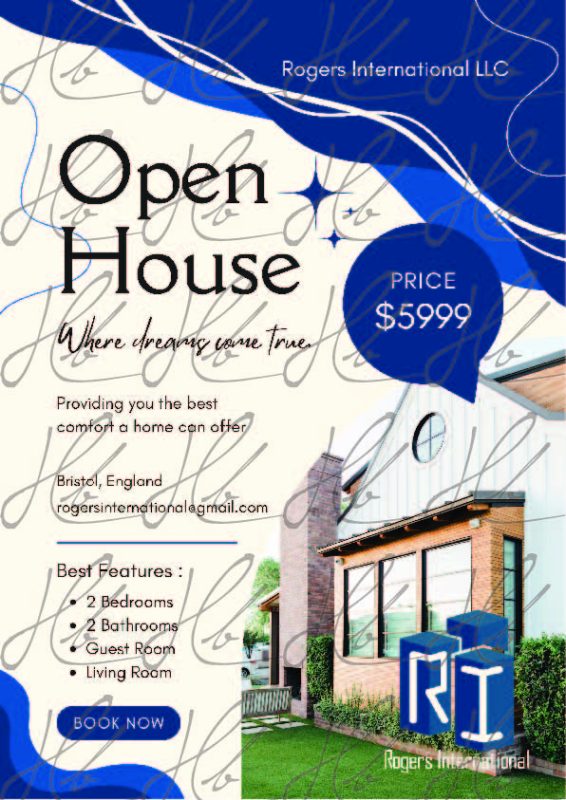
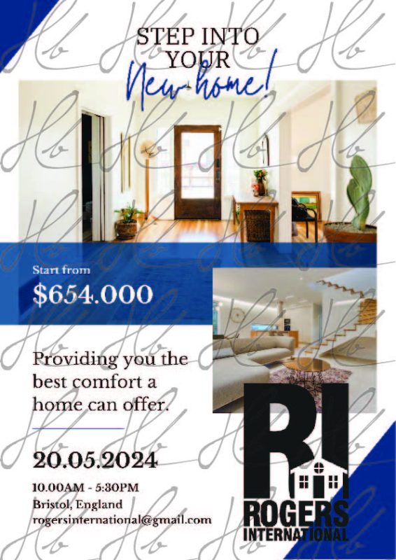
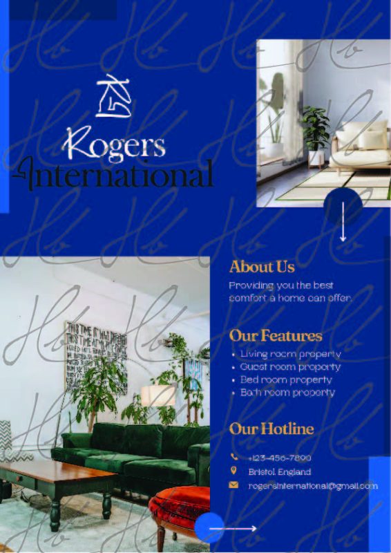
Rogers International LLC initially approached me for a full set of branding and marketing materials, including three logo variations and six real-estate promotional flyers. While the company ultimately turned out not to be legitimate and the final files were never delivered, the project remains a valuable part of my design journey and showcases my ability to adapt quickly across branding and marketing styles.
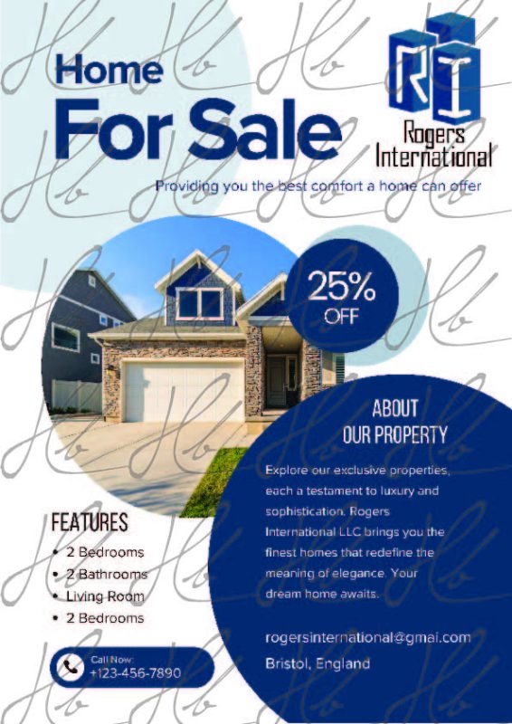
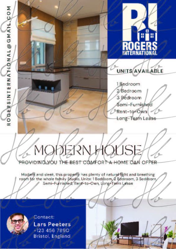
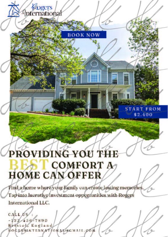
The brief positioned Rogers International as a real estate agency, requiring marketing collateral for homes and apartments, both for sale and for rent. I developed clean, modern flyer layouts designed to highlight property features, pricing, and imagery in a polished, professional way. Each flyer followed a consistent visual language—strong hierarchy, clear callouts, and inviting design elements to help properties stand out.
Alongside the flyers, I created three unique logo concepts, each exploring different directions within a corporate real-estate aesthetic:
- A modern, geometric design representing structure and reliability
- A more traditional emblem-style option
- A sleek, minimalist wordmark for a contemporary, high-end feel
Even though the project was not completed due to the discovery of its fraudulent nature, the work itself demonstrates versatility, strong branding skills, and the ability to deliver cohesive marketing materials across multiple formats.
